Data Visualization – Keeping it Simple

This post is dedicated to economist magazine’s data science crunchers and visualizers who toil week after week to produce high quality  material. I have taken liberty with some of their content to show how dedicated they are in their craft. The other  organization is the Guardian the newspaper – they have excellent data team.

Context
In week of July 23rd – we will have BigData conference (5th Elephant)right in our backyard – courtesy the hasgeek team. Hopefully attendees will take advantage from the 2 days packed agenda. Right now early bird discount is on. The focus is on tools, processes and best practices. It will have special section on visualization. D3, Excel, process, python will be talked upon and discussed. There is off course much awaited session from Anand.

For me it is not the infrastructure but the questions that we ask of data that matters.Once on that path visualization is great help to unfold the meanings, co-relations, insights. Some tools are better suited than others to convey the “gist”.

Data visualization is intricately linked to interpretation of the issue. Following are the items from economist magazine where data shines to bring out the issue in open. One of them is an aberration as it takes longer to comprehend the gist. In general most of them get the point across.

The easy ones

European Bank capital requirement under severe recession

a. Hell Holes is as simple as they come – we have clear title, description on the top and source at bottom. A simple bar chart plots countries against the requirements. White vertical lines accentuate the boundaries. All this helps the viewer grasp the information very-2 quickly. We are made aware that Banks need lot of pull in terms of money if worst comes to worst (Spain was just bailed out)

Cost as % gdp for environmental degradation

b.Eat your greens plots the % of gdp as cost of environmental degradation for various developing countries. Latter part is just educated guess and G-20 are not part of the display.

Different strokes
Loan burden

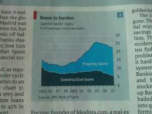
c. Different strokes is classic economist staple chart showing 3 different “metrics” for 4 different countries over same number of years. Simple inference one can draw is that Spain is better of the lot except in employment. It is directly co-related to the construction boom which was present in Spain. Apparently one more graphic also shows how banks lent for property loans more than anything else.
Happy with monarchy
Happy with monarchy

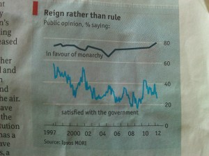
d. Reign rather than rule shows people still like monarchy over their “satisfaction with voted government” in Britain. Country name is missing – but since this graphic is part of the article focusing on monarchy in Britain, I have taken the liberty to provide that information. We see interesting delineation of the century where explicit qualified 4 character full year mention of 1997, 2000, 2012. The years between 2000-2012 are mentioned in 2 characters but we are sure of where this point lies in timeline. There is small vertical line on horizontal axis on either side of the year timeline. I am assuming it just indicates “continuity”. Horizontal lines again provide clarity in terms of the slope of the line.
Ethnic Hotchpotch
Ethnic Hotchpotch

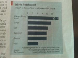
e. Ethnic Hotchpotch in kenya graphic shows how fragmented the country is with various tribes making it up as % of total population. Interesting graphic is the 1st horizontal row depicting the “Kikukyu/Meru/Embu” tribes. It shows a break in the horizontal bar as the graph only accommodates 15 % depiction. Wisely the rest of the proportion is shown outside the 15 % and indicated by the “quantity- in this case 27”. Graphic also clarifies lot of details in terms of “covered data”.

Houston we have a problem

f. Houston graphic shows various city population density per hectare against CO2 emissions(in tonnes) person. The same size circles are scattered all over with white ones pointed out for differentiating them from others. It does bring out the fact that both Texan cities are in bad shape even though people density is very less.
Foreign or local
Foreign or local

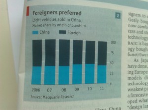
g. Stacked bar chart shows out of the total vehicle sales, folks in china still prefer foreign brands. Here again the background white bars accentuate the data.That slight extra overhang does a beautiful job of helping to differentiate the numerical indicator.
Anti social behavior

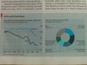
h. Anti social behavior graphic has two graphics – line chart plots two quantities – number of trips, distance. Both of them are going down. The pie chart shows the “reason” for the trip and % change from 1995-97. There two small issues here , title does not indicate the country so it does not stand by itself. Pie chart indicates it is change between two years but reference old year is given as range 1995-97. Shopping trips could have gone down as people do multitasking – as they might pick up groceries while coming back from home. This is made possible if convenience store is near the transportation link. Why visiting friends has gone down is strange  but could be explained by social media presence 🙂 ?
Merkel the popular one

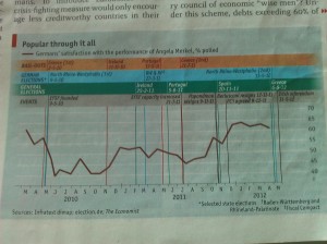
i. This particular graphic plots German chancellor’s popularity across Mar-2010 to May-2012. Events, Bailouts and dates are superimposed to provide deeper context. Angela Merkel’s popularity has never really wavered and gone few notches higher. This corresponds to her handling of Spain and Greece. It did waver during  Ireland, Portugal crisis.Although German elections are mentioned it would have helped if “% of seats/representations increase/decrease” was mentioned.

Medium ones
Women at work
Women at work

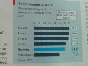
a. Women at work is simpler graphic with addition of numerical on right overhang with Germany pointed out with different color. Data is qualified for the year 2010. This graphic stands on its own to share important information wrt important bill to help women stay back and take care of the family.
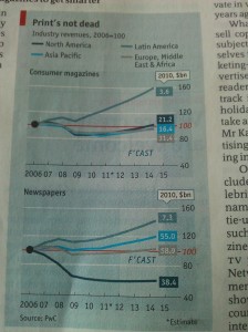
Print is not dead
Print is not dead

b. This plot shows revenue of magazines, newspapers across 2006-2010 plus forecast till 2015. It also indicates 2011 date is an estimate. 2006 revenue is taken as base of 100 thus bringing out the scale of increase in magazine revenue. This base is differentiated with color of 100 horizontally.Interesting addition is the numerical figure which indicates the sales figure of 2010. The color background of the numerical figure also co-relates the areas.
This has to be the most beautiful representation of the data which conveys that magazine/newspapers are surviving with former doing far better than latter. There is a slight background color change for the period of 2012-2015. (just that touch- again shows the dedication)
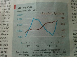
Stormy seas
Stormy seas

c. Stormy seas graphic shows that container shipping industry might be making comeback after real bad last year. The prices might be going up due to lack of capacity or exhaustion of the excess capacity. While reading the article it was clear that container building industry finally stopped building lot of capacity. Last year prices of freights were down with fuel prices were going up. One phrase which stands by itself and is bit confusing “Asian-northern europe centistoke bunker fuel”. This is way too much of “clarification data”. Use of colors to differentiate the 2 y-axis data and the plot is helpful in making the above conclusion.
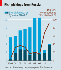
tnk-bp
tnk-bp

d. TNK-BP shows one important thing – BP is sucking away the dividends from the subsidiary, it has specially extracted a lot last year(close to 90%). Idea of showing the % inspite of the stacked bar is wonderful as it conveys in % the exponential increase. Looks like this subsidiary is going to find its own money next year.
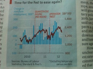
Easing again - another initiative to push
Easing again – another initiative to push

e. Now a graphic which juxtaposes employment as bar charts across month from 2010 Jan to 2012 June.The employment seems to be falling from its peak of 2012 January.S&P too is going down at this juncture.Two specific rounds of “push” are indicated across the vertical.

Both these above graphics show horizontal axis used to indicate two different metrics. This condensation is important to help comprehension.

Tough ones

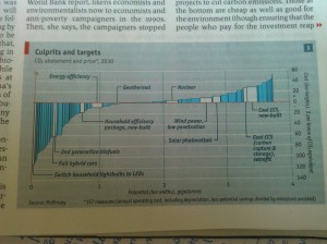
CO2 abatement cost

a. Now comes the most interesting graphic which compresses lot of information and requires concentration from the reader. Right from the word abatement down to heights/width of the bars everything has to be explained and understood in its entirety. Basically as far I could see it is trying to say – cost of abatement of co2 by certain year for certain activity and its potential is so much. I would guess it is called a form of variwide chart?

Mcwages and BMPH (Wages and buying power – is the economy slowing down)

b. Now to much better analysis and its representation. This confirms economist estimates of slowdown and also indication of lowering of living standard in US. It also is a good attempt to compare the real wages vs buying power across countries. Author of this study has data about wage and burger prices.  Economists divide the cost of the Big Mac by the McWage to get “Big Macs per Hour” or BMPH in comparing countries. Two graphics together tell us that us, canada, western europe, japan have similar wages. The developing countries – specifically India earned about 10% of the developed world.In the U.S.,  BMPH was 2.4 in 2007. McWage is up 26% in four years, but the cost of the Big Mac is up 38%, due to possible increases in food prices. The net 9% drop in US BMPH is one sign of a reduced overall standard of living. In Russia, the BMPH increased  152% from 2000 to 2007 and has increased another 42% from 2007 to 2011. China has had increases of 60% from 2000 to 2007 and another 22% from 2007 to 2011. India saw a large increase of 53% from 2000 to 2007 but  BMPH declined by 10% from 2007 to 2011.
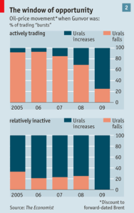
window-of-opportunity
ural-falls (part graphic)
ural-falls (part graphic2)

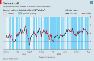
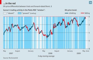
c. Now the most interesting set of graphics which indicates govnor trading was either a signal or simply driving the ural prices(a heavier crude with more sulphur) compared to brent. It does not have the brent data but ural data from Jan 2005- May 2009 is plotted with periods of “guvnor” trading. Most of the time the trend/pattern one can see is that prices fall down. But we need to temper it with brent data to see any co-relation. The conspiracy theory off course is that guvnor bought the oil at lower price and sold it to Europe at higher price. Now …isn’t this great detective work. Apparently this study was done over 2 years.

One common thing you will notice is the red bar for every graphic. Sometimes if article has multiple graphics they also have # in right top. Consistent and concise and all that Data science work proving  it is the question which matters and not the tool/infrastructure knowledge. They can be developed/leveraged. Right now many folks are struggling why/when to use BigData(how to get it, store it, analyze it).

Books on visualization –

  • Show me the Numbers, by Stephen Few (Amazon)
  • The Visual Display of Quantitative Information, by Edward R. Tufte (Amazon)
  • The Wall Street Journal Guide to Information Graphics, by Dona M. Wong (Amazon)
  • Visualize This!, by Nathan Yau (Amazon)
  •  Information Visualization, by Colin Ware (Amazon)
  •  How Maps Work, by Alan M. MacEachren (Amazon)
  • The Back of the Napkin, by Dan Roam (Amazon)

At times visualization clutters up the information and leaves the reader confused. This is one case of NYtimes. How do the middle & top quintile person compare? Sometimes just plain representation of data is wrong – How can accuracy be 120% – in case of paper on analysis of liver issues. So overdoing it, doing it for sake of it is not advisable. That is why I like economist’s use of plain graphics. They get point across without cluttering up too much.

Although there are many visualization websites – this is neat.
Image

Data Quality Services(DQS) – deduplication/matching Hindi data with SQL Server

This is an attempt to do 101 of 101 (Vinod and pinal know the reason why we have to do this :()  .  I have been interested in de-duplication for longest time and wished DQS was released earlier so that with 2012 they could have had “fresh” start.

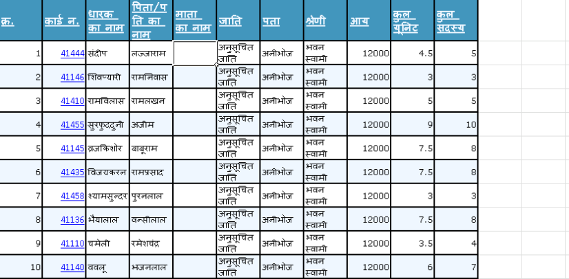
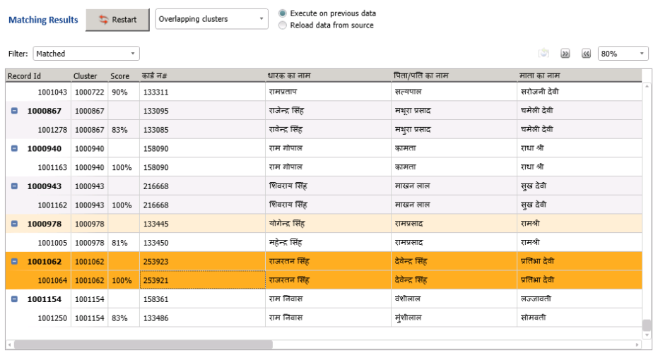
In any case here we are looking at data from http://fcs.up.nic.in/upfood/helpline/ReportRegidWise.aspx. Idea is to find potential duplicates using set of attributes like card holder name, father/husband name, mother name. This data is represented in excel here. (data could be present in SQL too).

Image

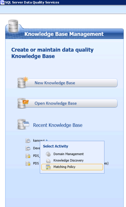
To do matching a dqs project of sql server (matching policy) needs to be created. Image

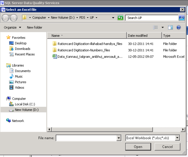
We need to choose the data source which is the excel in our case.

Image

Now we need to choose the source of data-sheet number where data resides. Row header option needs to be chosen to indicate first row has the names of the columns. Image

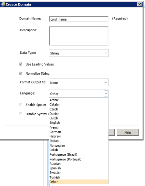
Important element of matching is defining the domain – which is essentially defining data about the data. In this case metadata about the column we are going to examine. It involves giving the name, datatype at minimum (data/integer/decimal/string). For name columns we are going to use string data with language as “other”. This ensures Hindi etc can be compared.

Image

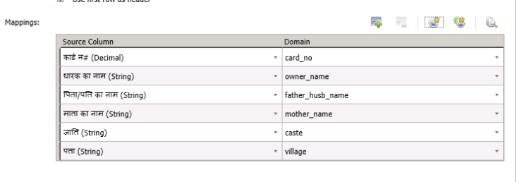
Once the domain is defined we need to map the columns to the domains which is pretty straight forward process.

Image

Now we need to define the rules for matching. In our case we are going to compare the rows based on 3 attributes(card holder name ,father/husband name, mother name). One can do exact search but we will choose the similarity based lookup. We also need to give weight to the column which will be used to dominate the comparison. We have chosen 70,20,10 across cardholder,father,mother names.

Image

After this is simple start or profiling.

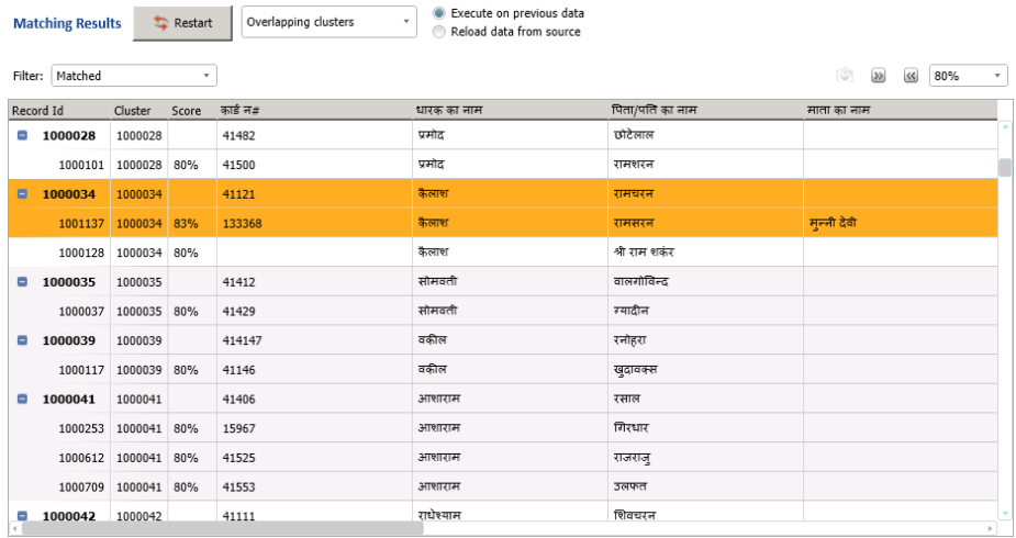
Once you look at the matched results – there is Mr. Kailash who has same sounding father in two villages  – potentially a duplicate.

Image

Then we have exact matches

Image

The profiler can show the need of data cleansing/messaging. Honestly every de-duplication exercise should first undergo normalization/cleansing process followed by physical verification process. As data can indicate only so much. It is also better to have more columns to compare to provide granular control.

Nearly 40% data for mother’s name is missing as is card # :(.Aadhar can simplify the enrollment by cleaning up the duplicates from here and comparing it with others – unfortunately they wanted “completely new” enrollment etc.

Image

Background – 

Dedupliction and cleansing is required while creating DW or just cleaning the data. Imagine creating a customer 360 view where data for customer is coming from multiple systems. Unfortunately as it can happen information about cusotmer in different systems can be represented in slightly different way. One needs to cleanse this data and de-duplicate before using it to make decision.

String comparision functions in SQL Server
SQL Server has = operator which can help to compare similar values. Like operator goes a step further to match approximately similar strings but misspellings are not its strength. Soundex/Difference play a role to compare phonetically two strings. Master Data Services adds Similarity function. This function is unique in the sense that it adds Levenshtein edit distance, Jaccard similarity coefficient,Jaro-Winkler distance, Longest common subsequence algorithms.

Jaro-Winkler is usually the best algorithm but should be verified with own data.

Hopefully in future DQS/MDS/Phonetic pieces are integrated for simple usage.

Use Case Scenarios
Banks/Insurance agencies, Government programs (PDS/election card) all have data which needs cleansing and scalable de-duplication services. Sometimes data entry errors like reversal of first & last names results in not matching of names.
Generally data-duplication involves little bit more complexity – where other attributes like age, location address etc also play a role. If age is within months vs years is an expensive query. Location addresses have an issue where addresses are not standardized like US.

Name matching by itself can be applied to detect frauds or law-enforcement or counter-terrorism.

It is a hard problem because of
-misspelling, variations, cross language bias, nicknames, name ommission (english middle names are ommited, Spain-maternal name can before first name), Data Entry errors.

Comparison of methods

Click to access iiweb03.pdf

Advanced methods

Many of the algorithms/techniques come from BioMedical world – especially gene-sequencing-matching world. Most of them focus on gaps/transitions. One of them is  Smith waterson  Gotoh – http://www.bioinf.uni-freiburg.de/Lehre/Courses/2012_SS/V_Bioinformatik_1/gap-penalty-gotoh.pdf. For example – Sequence similarity search – http://biochem218.stanford.edu/07Rapid.pdf , or http://www.bioinf.uni-freiburg.de/Lehre/Courses/2012_SS/V_Bioinformatik_1/lecture3.pdf

Good Reference – When you have lot of time – A guided tour to approximate string matching – Navarro (ACM paper)

Phonetic methods apart from soundex are
NYSIIS
Phonix
Editex
Metaphone
Double Metaphone
Phonetex

Not all of them are applicable to all languages and available in all databases.

SSIS component for use

Lookout for MelissaData which does matching on multiple columns, works out of SSIS and has various algorithms implemented as part of it.

OSS

SecondString.  (sourceforge)

Desired Features

Need for reports/API
– DQS needs to support offline, api based interaction to generate reports. This will not require login into the application.

Need to have more transparency about algorithms/pluggability for different languages
– MDS algorithm should be combined here and choice should be available for choosing the relevent algorithm. Similarly stemming algorithms should be pluggable and available for “choice”. More phonetic algorithms should be added.

Performance guide

http://www.microsoft.com/download/en/details.aspx?id=29075

One stop guide for DQS

http://technet.microsoft.com/en-us/sqlserver/hh780961


Data Quality Services(DQS) – deduplication/matching Hindi data with SQL Server

Session summary at TechED 2012 – NoSql(Non Relational Store) for relational person

Like every year I opted for session delivery. One of the session was picked up at last minute and the organizers (Harish/Saranya) approved it immediately. Unfortunately I was little late, anyway scrambled a bit and got the deck and demos up. But I did not pray to demo Gods. Right from display to connectivity to remote server everything played up – this after checking the display 2 days ago and connectivity everything working till last minute. I had backup connection too.

Big learning

Backup for network is another network, but backup for machine is needed. If possible locally. Just don’t remote into different server machines for demo – however comfortable it is at other times.

So anyway this session is 101 for people who are comfortable with relational databases and want to understand why/when/what to use in their scenarios. I chose Redis, Riak, MongoDB, Azure storage/SQL Azure to showcase for 2 min exploration each as this could not have been tutorial for them. I did not have time to explore the MPP/Columnar stores or get deep into how, idea was to convey – why/when and the possible impact. I also did not get into amazon store(s) or coherence, inmemory db etc.

I chose Redis – as it brings familiarity of memcached/velocity, Riak because it is sort of everything from kv,document to search store and ability to add/delete nodes is simple/powerful. I chose MongoDB to just de-mystify the storage – access via indexes/mr of javascript.

Whole idea was to help folks contrast these stores with Relational store from pov of what they are comfortable with (indexes, joins, acid, schema,
monitoring, management). One of the simplest way to skin is to ask question about range queries, index/updates.

Here is the link to the presentation – http://speakerdeck.com/u/govind/p/non-relational-storage-for-relational-person

Session summary at TechED 2012 – NoSql(Non Relational Store) for relational person

SSIS continues to SUCK

It forgets the settings on the datasources. It forgets just a sec back it could access the database without any problem. It forgets to remove old metadata. It is the messiest tool ever.

I worked with it during SQL 2005 – it scaled heights of  absurdity then, It continues to match 2008 version. It is not worth spending time.

I am going back to bcp. It is a pain but I at least get reasonable answers.

On Windows 2008 – it requires you to execute the package as admin as it can’t access perfmon counters(no don’t ask which ones). The execute package utility is sham – it can’t remember it needs to set the /X86 option if it sees the jet oledb provider if either the source or target is on 64 bit machine. Now don’t even get me started on 64 bit provider option – it is a shame that most of the people get/accumulate data through mdb, but 64 bit provider does not exist.

The errors are thrown are gem – CANTACQUIRE…connection – but prey few mins ago – you did without sweat.

No I am not the only one.

SSIS continues to SUCK

Accessing Jet DB on 64 bit windows – “Microsoft.jet.OLEDB .4.0 provider is not registered on the local machine”

Update(5th Feb 2010  19 Aug 2011) – There is beta driver download available        OLEDB provider – Microsoft Access Database Engine 2010 Redistributable – http://www.microsoft.com/downloads/details.aspx?familyid=C06B8369-60DD-4B64-A44B-84B371EDE16D&displaylang=en


Simple Answer – There is no 64 bit version of DAO provider, Jet OLEDB provider or ODBC driver – it is just 32 bit version of the provider which runs in wow64 mode.

Scenarios

1. 64 bit SSIS/ETL tool package trying to access Access/Jet database natively using 64 bit drivers.

2. 64 bit native applications (forms/console apps) natively accessing the database.

3. 64 bit native open source frameworks (rails/python based stuff) trying to access the database through regular ado/odbc provider/driver.  (lookup the favourite support dl – sorry I do not have answers to adodbapi, odbcmx etc etc…)

4. For pure asp.net applications follow advice of Ken tucker (MVP).

Workaround : One needs to create/use 32 bit application in wow64 mode to ensure 32 bit jet oledb provider can be used.  In simple words – just change the compile target to x86 in Visual studio or make file.

Project Settings ->Build ->Platform target -> change the target to x86.(you can accomplish the same with command line too with /platform option)

[update]To deal with SSIS’s rude behavior on 64 bit – check out the /X86 option to execute package on commandline. Also ensure Run64BitRuntime is set to false in the the metadata.

Brute force alternative (Update) – Use Corflags.exe as last option in dire circumstances for “just trying it out”. This only works for .net images/assemblies. No hex editing please :), not supported.


Reason :

There is no 64 bit version of jet driver (hopefully they do as most of the machines will be 64 bit, it will look pretty odd to have to use this trampoline and not being able to do true migration – not everybody will like to migrate to sqlexpress).

via http://www.tech-archive.net/Archive/Access/microsoft.public.access.dataaccess.pages/2006-11/msg00013.html

Detailed – x64/x86/Wow explaination is available here.

Official word(well blogs are as official as they come)  on mdac roadmap.

Update(5th Feb 2010) – There is beta driver download available – http://www.microsoft.com/downloads/details.aspx?familyid=C06B8369-60DD-4B64-A44B-84B371EDE16D&displaylang=en 

Official statement(5th Feb 2010) – http://blogs.msdn.com/psssql/archive/2010/01/21/how-to-get-a-x64-version-of-jet.aspx

Accessing Jet DB on 64 bit windows – “Microsoft.jet.OLEDB .4.0 provider is not registered on the local machine”

OpenID, OAuth and securing the citadel

Will web become closed in future where there will no way to access unauthenticated data alltogether? Sort of driving license for the of internet? All the swarm of protocols/agreements like OpenID, Oauth, Dataportability , apml will they not drive the content generators to enforce a “id” which can be tracked and information used everywhere?

Nope I do not have problems with all these nanoformats trying to get semantics of the “stuff on the page” , I am just afraid of the “market forces which will ensure access to information unauthenticated is not allowed”, I am just worried about access to the data/information without the need to identify yourself ever.

Update- I got some comment from lawyer type(? – did not leave email address/blog) – that Citadel is “Popular” open source email and groupware platform and it now supports OpenID authentication.

To be fair – I had never heard of citadel before ! and the context too was completely different. I love these subtle guerrilla ploys. This adds spice in ironic way to the current post.

OpenID, OAuth and securing the citadel

When is ISCII better than UNICODE and vice versa

ISCII is great to store names(people/location etc) which do not vary across languages. Consider a 10 Million names database storing names of people which need to be picked up during reports across different languages. One row storage of ISCII can take care of the names and transliteration provided by  .Net encoding classes (similar effort can be applied to Unicode too but without lot of success) help display in various indic languages. In case Unicode encoding you will need to store a language specific name( this too could be useful if you are hell bent on correcting names/matras to suit local language) -thus multiplying storage cost.

The cost of storing ISCII is offset by need for translation into Unicode for display(IE is quite ahead in terms of display of unicode data with appropriate font)/capture (with help of INSCRIPT or local variant of phonetic or web based entry).

Indexing/sorting – language specific sorting can be different (Tamil is very different from other languages). A topic for another post alltogether.

When is ISCII better than UNICODE and vice versa

Understanding Indian Multilingual computing

After my colleague and respected friend Deepak Gulati implemented the transliteration from Kannada to english and back for one of the projects, my interest in understanding the challenges increased beyond the windows api coding of locale specific world and initial palindrome check for multibyte characters :).

I found a great resource via IITMAchraya explaining the same with context of Indian languages.

In the present project I also gained new respect for southern languages which do not add to the confusion like Hindi’s devanagari  or English does. Phonetic base of these languages helps in correct granular correct pronounciation and representation using a good script (brahmi origin).

Words are just C,V, CV,CCV or in extreme cases CCCV where C stands for consonant and V for vowel. Challenge lies in way the vowel is combined with consonant to provide that unique syllable representing the sound. Challenge with Devanagari representation of words like राष्ट्रिय, आत्मविश्वास,विश्व are pretty difficult to get right in the head, we just remember it by rote and as we did in childhood make fun of people south of Vindhyas for not getting matra, ling etc right.  I was spelling nazi (remember soup nazi) and supporter of Hindi as the national language. But lately – must say pretty lately I have come to appreciate the Tamil language (why there is no need for the people residing there to learn hindi – why that is false patriotism, why it stokes the “rule” by the north and resistance feeling, heard even ravan killing is sort of white north wnning over the dark dravidian) and its bretheren. With help of Nudi keyboard which is phonetic in nature – I am finding it easier to learn/type spoken kannada. The default keyboard is inscript which is common for Indian languages but then it loses the nuances of each language.

MS has taken steps over number of years to support multiple languages except providing local language OS 🙂 – now I can appreciate it little better as it would be tough to get it right and then maintain it.

there are 4 parts

Entering ( keyboard, mapping to qwerty)

Displaying (font -glyph)

Storage (encoding – how many bytes to store a syllable)

working with data (sorting/searching/frequency count etc).

With this new information I have new found respect for Sanskrit which can pack so much of information in such short shlokas/stotras. 

Understanding Indian Multilingual computing